Kupid AI Site Review
Last updated: 02-Apr-2026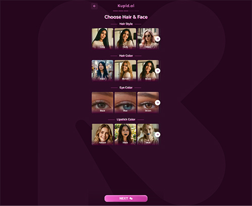
Deepx.club
Kupid.ai

Hornydreams.ai
Kupid AI
Kupid.ai
What You See First
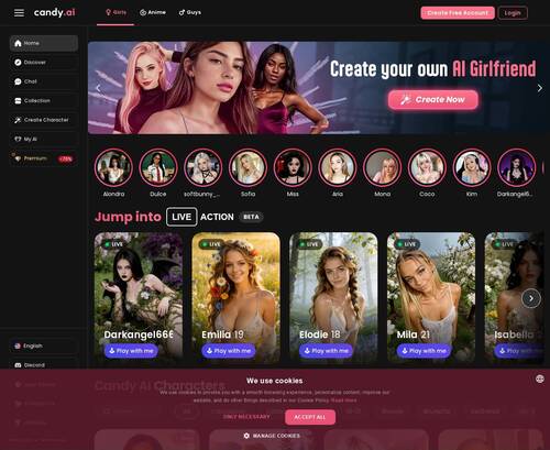
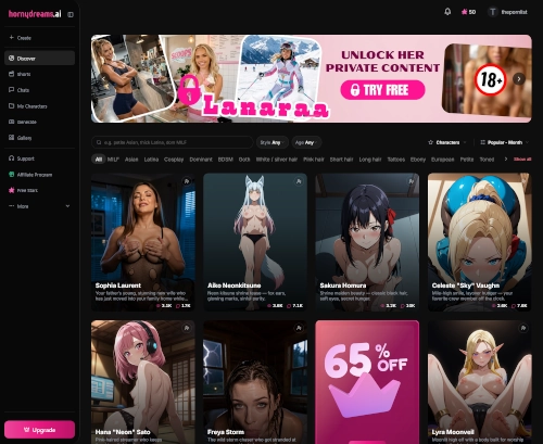
Kupid.ai gives off a pretty straightforward first impression. The page feels built around character discovery, with profile based browsing taking the lead instead of a flashy landing page trying to oversell itself. Visually, it looks organized enough to scan without much effort, and the main focus is clearly on browsing different AI personalities rather than digging through a lot of text.
The overall layout seems more functional than stylish. It is easy to get the idea right away, you are here to look through characters, check their vibe, and pick one that matches what you want. That part is clear fast. The page structure looks familiar if you have used other AI companion or roleplay sites, with a grid driven setup that puts faces, names, and short identity cues front and center.
It does not come across as cluttered, but it also does not feel especially distinct. A lot of the visual weight sits in the character cards, so your first impression depends a lot on how varied those look. At a glance, there is enough range in presentation to keep it from feeling flat, though the format itself is very template heavy.
How It Feels to Use
This is one of the better parts of the site. Getting around looks simple, and the browsing flow seems built for quick sorting rather than long digging. Categories, tags, and style based grouping make a real difference here, because a site like this can get messy fast if everything is thrown into one endless feed. Kupid.ai avoids that problem reasonably well.
If you know what kind of personality or look you want, the structure helps narrow things down without much friction. You can move from broad browsing into more specific preferences in a way that feels natural. It is the kind of setup where you can either click around casually or go in with something more specific in mind and still get somewhere without wasting too much time.
The other useful part is that the site does not seem locked into one type of interaction. It supports both chat and image generation, which makes the platform feel more complete from a usability standpoint. You are not just picking a character to talk to, there is also a visual side to the experience, and having both in one place makes the whole thing feel more connected.
Nothing about the browsing flow seems especially confusing. It is mostly direct, and that matters more than fancy design on a site like this.
What’s Actually On Here
The main draw is the size of the character library. There is a broad selection of pre-made characters, and they cover a decent spread of personalities, looks, and backstory styles. Some lean more romantic, some more playful, some more dominant or fantasy driven, and that variety gives people a lot to work with when they first start browsing.
This kind of setup works well for people who do not want to build everything from scratch. Instead of starting with a blank page, you get a lot of ready made options with different identities already framed for you. That makes the site feel active and easy to jump into.
There is also a nice mix in how characters are presented, at least on the surface. Different backgrounds and personality cues help separate them enough that browsing does not feel totally repetitive at first. The platform seems aimed at users who want both conversational interaction and generated visuals tied to the same character concept, which gives the content more range than a chat only setup.
In terms of overall scope, it feels broad rather than deeply specialized. There is enough variety to support general exploration across different tastes, and the category and tag structure helps that variety feel usable instead of random.
Where It Falls Short
The biggest issue is that a lot of character profiles start to blur together once you have looked through enough of them. Even when names, visuals, or short bios change, the underlying profile format feels very similar from one entry to the next. After a while, that takes some of the novelty out of browsing.
This is one of those cases where a large library helps at first but can feel thinner the longer you scroll. The site gives you plenty of options, but not every option feels equally distinct. If you are the kind of user who wants very specific personality writing or truly unusual setups, the repetition may stand out more than the variety.
That does not make the site hard to use, but it does make the browsing experience feel a bit samey over time. You can still find different styles and preferences fairly easily, though some of the individuality starts to feel surface level once you move past the first batch of profiles.
Who Will Get Value From It
Kupid.ai makes the most sense for people who want quick access to AI characters without dealing with a complicated setup. If your main goal is to browse, pick a type you like, and move into chat or image generation without much friction, it fits that use pretty well.
It is also a decent match for casual users who like having a lot of options in front of them right away. The site is easy to scan, the sorting tools help, and the mix of chat plus image features gives it more to do than a one note character page.
On the other hand, people who are very focused on originality might hit a wall sooner. The selection is broad, but some of the profiles feel built from the same mold. So the site works best for someone who values convenience, range, and easy browsing more than deep uniqueness in every single character.


 Large selection of pre-made characters with diverse personalities and backgrounds
- Easy browsing with categories, tags, and styles to quickly find preferences
- Supports both chat and image generation features in one platform
 Large selection of pre-made characters with diverse personalities and backgrounds
- Many character profiles follow similar templates, reducing uniqueness over time
 Many character profiles follow similar templates, reducing uniqueness over time