Nudiva Site Review
Last updated: 01-Apr-2026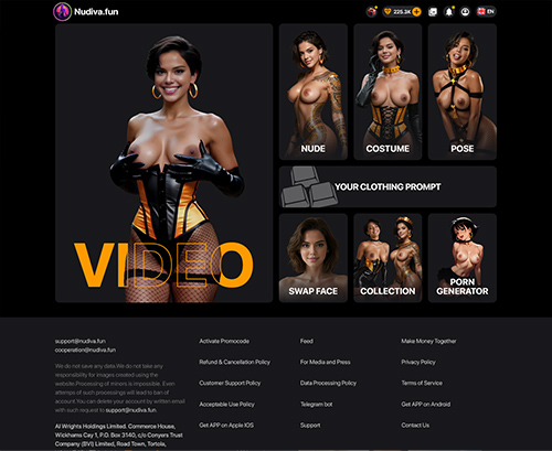
Createporn.com
Nudiva.app

Secrets.ai
Nudiva
Nudiva.app
What You See First
Nudiva.app comes off pretty plain at first glance, which is not a bad thing here. The layout feels stripped back and focused, without a lot of extra clutter fighting for attention. It looks more like a tool page than a typical adult tube or gallery site, and that makes the first impression feel direct. You are not dealing with a homepage packed with endless rows of thumbnails or a bunch of noisy sections stacked on top of each other.
The visual style seems built around getting you into the main function quickly. There is not much in the way of decorative stuff, and the page gives off a simple, task based feel. That keeps it approachable, especially if you just want to understand what the site does without digging through a lot of filler. At the same time, the plainness can make it feel a little bare, depending on what you expect from an adult site. It is clean enough to avoid confusion, but it does not have much personality.
How It Feels to Use
This is the part Nudiva.app handles fairly well. The setup feels straightforward, and it does not seem like the site is trying to bury the main action under extra pages or unnecessary steps. The flow looks centered on getting something generated without much delay, which makes the whole thing easier to grasp right away. You can move from landing page to actual use pretty quickly.
One thing that stands out is the presence of adjustable settings. That gives the site a bit more flexibility than a one click tool with no control at all. If you want to steer the result toward a certain style or preference, there is at least some room to do that instead of just taking whatever comes out. That makes the browsing and use flow feel more interactive, even if the overall structure remains simple.
Payment support also looks familiar enough that it should not feel unusual to most people. That matters because odd or limited payment setups can make a site feel sketchy fast. Here, the process seems more standard, which helps the platform feel easier to deal with mechanically. Overall, it is not a complicated site to figure out, and that is probably its strongest point.
What’s Actually On Here
Nudiva.app does not present itself like a big content library with lots of built out sections, categories, and pages to browse through. The core of the site appears to be result generation, not a huge archive of preloaded scenes, clips, or galleries. So the content side feels more shaped by user input and adjustable options than by a traditional catalog.
That changes the way the site works compared to more common adult platforms. Instead of browsing through a deep stack of categories, performers, or tags, the material here seems tied to what you create through the available settings. The variety comes less from a visible library and more from how much control the site gives you over the output. If you like tweaking preferences and trying different styles, that setup makes sense.
Because of that structure, the site feels narrower in scope but more focused. It is not trying to be everything at once. There is a clear emphasis on generating tailored results instead of offering a giant pile of existing content. For some users, that will feel more useful than scrolling through endless pages that all start to look the same.
Where It Falls Short
The biggest friction point is also central to how the site works, you need to upload images. That is going to be a real hesitation point for some people, especially on an adult site. Even if the interface itself feels simple, asking users to provide their own images adds a layer of caution that you do not get on a standard browse and watch platform. Some people will be fine with that, others will stop there.
There is also a limit to how much depth you can expect if you are coming in looking for a broad adult browsing experience. Since the site appears focused on a specific tool based function, it does not seem built for long sessions of category hopping or casual scrolling. If you prefer a site where you can bounce between lots of sections and discover different kinds of content just by clicking around, this may feel a bit thin.
The plain presentation, while easy to understand, can also make the whole thing feel a little basic. It gets the job done, but it does not offer much beyond the core process. That keeps things efficient, but it also means there is less to explore once you understand the main workflow.
Who Will Get Value From It
Nudiva.app makes the most sense for someone who wants a direct, tool style adult site and does not want to waste time figuring out a messy interface. If your goal is to get from page load to results quickly, the site is set up in a way that supports that. The adjustable settings help too, since they give you some say in how the output turns out instead of locking you into one fixed path.
This is a better fit for users who want control and are comfortable providing the required image input. That part really decides whether the site works for you or not. If uploading images is not something you want to deal with, the appeal drops off fast. But if that does not bother you, the simple layout and short path to results make the site easy enough to use.
For casual adult browsing, it is less convincing. There just is not much sign of the kind of deep, scroll heavy content structure that keeps people clicking around for a long time. For focused users who want a specific function and a fairly painless interface, it feels more on target.


 Easy to get started with a straightforward interface that lets users produce results in a short amount of time
- Accepts widely used payment methods
- Includes adjustable settings that allow users to tailor results to different preferences and styles
 Easy to get started with a straightforward interface that lets users produce results in a short amount of time
- Requires users to upload images, which can raise concerns
 Requires users to upload images, which can raise concerns