Kupid AI Site Review
Last updated: 02-Apr-2026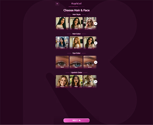
Mybabes.ai
Kupid.ai

Gptgirlfriend.online

Kupid AI
Kupid.ai
What You See First
Kupid.ai opens with a pretty simple look, and that is the first thing that stands out. It leans into a swipe and chat style layout instead of trying to pack the page with too many moving parts. The overall impression is closer to a dating app than a typical adult site, which makes it feel lighter and easier on the eyes right away. It does not come off as especially flashy, but it also does not feel cluttered.
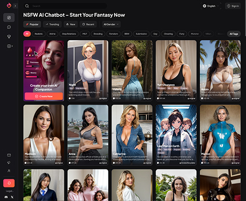
The homepage style looks built around profile browsing and quick interaction. That gives it a cleaner landing page than a lot of adult platforms that throw endless rows of thumbnails at you from the start. Here, the visual focus seems to stay on people, profiles, and chat entry points. That makes the first few seconds pretty straightforward. You are not stuck figuring out where the main action is supposed to be.
It also helps that the layout feels familiar. If you have used any swipe based app before, the basic structure clicks quickly. Nothing about the front page feels overloaded, and that makes the site feel more approachable than many busier adult pages.
How It Feels to Use
Using the site feels direct. The dating app style setup keeps the main actions obvious, and that matters on a site like this. You can move from browsing to starting a chat without much friction, which is clearly one of the stronger parts of the experience. It does not feel like you need to dig through layers of pages just to get to the point.
The tag and category setup also does a lot of work here. If you are looking for a certain type of profile or a specific preference, the site seems built to help narrow things down fast. That makes browsing feel more intentional than random. Instead of just scrolling and hoping something relevant appears, you get more control over where you go next.
The overall click flow seems easy to follow. Main sections are understandable, and the site does not appear to hide its core functions behind confusing labels. That said, the experience seems centered more on quick discovery and immediate chat access than on deeper profile exploration. If your goal is to jump in and start interacting, it works well. If you want a slower path with more layered discovery, it feels a bit lighter.
What’s Actually On Here
The content here is structured more around profiles, preferences, and chat based interaction than around a traditional video library. That changes the feel of the whole site. Instead of browsing scenes or clip pages, you are mostly moving through people and profile based options, with tags and categories helping sort what you are looking at.
The strong point is variety through organization. The category depth gives the impression that there is a broad spread of interests covered, and the tagging system makes that variety easier to access. This is the kind of setup that works well for users who know what they want and do not want to waste time scrolling through unrelated matches.
Because the site is built around quick profile browsing, the content feels more immediate than expansive in the usual adult site sense. It is less about building out a huge media archive and more about giving users a fast way to find a preferred type and start interacting. That makes the library feel functional rather than especially rich in detail. There is enough structure to support specific tastes, but the main focus stays on fast matching and chat entry, not on deep profile worlds or long form content pages.
Where It Falls Short
The biggest limitation is that the site feels better at quick attraction and surface level interaction than anything deeper. It is easy enough to browse and start chats, but it does not really give the impression of long term connection or much emotional depth. If you want ongoing interaction that feels more layered, the setup seems a bit thin.
That same simplicity can also make the experience feel a little narrow after the first pass. A streamlined layout is good for speed, but it can leave some pages feeling more functional than engaging. You get where you need to go quickly, but there is not much sense of buildup or discovery beyond the immediate browse and chat loop.
So while the site is convenient, it does not look like the kind of place that grows into something more involved over time. It works best in short bursts. If you are hoping for a more developed relationship style experience, this one may feel limited pretty quickly.
Who Will Get Value From It
Kupid.ai makes the most sense for people who want something fast, simple, and easy to steer. If your main goal is to browse profiles, filter by specific preferences, and move into chat without a lot of extra steps, the site does that well. The clean dating app style layout helps keep things moving, and the tag system makes it easier to avoid wasting time.
It is a better fit for casual browsing and quick interaction than for anyone looking for a more involved connection. People who like clear categories and a straightforward path from browsing to chatting will probably find it easy to use. People who want more emotional buildup, richer interaction, or a stronger sense of continuity may find it a bit shallow.
Overall, it feels like a site that knows its lane. It keeps things simple, organized, and easy to navigate, and that works in its favor. The tradeoff is that it stays pretty surface level, so the value depends a lot on whether quick access matters more to you than depth.


 Extensive tags and categories make it easy to find specific preferences quickly
- Simple, dating-app style interface makes browsing and starting chats easy
 Extensive tags and categories make it easy to find specific preferences quickly
- Less depth in emotional bonding and long-term interaction
 Less depth in emotional bonding and long-term interaction